When it comes to enhancing the aesthetic appeal of your home, choosing the right paint color can make all the difference-especially when working with porcelain, known for its timeless elegance and versatility. The right Benjamin Moore interior paint colors can complement and elevate the serene beauty of porcelain fixtures, whether in a bathroom, kitchen, or living space. As you navigate this exciting design journey, understanding how different hues interact with porcelain can not only create harmony within your space but also express your unique style. Dive into the world of color with us as we explore the best Benjamin Moore shades to perfectly pair with your porcelain elements, ensuring your home feels cohesive and inviting.
Choosing the Right Benjamin Moore Paint Colors for Porcelain
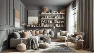
Choosing the right paint colors to complement porcelain can transform a space, drawing attention to its beauty while creating a cohesive look. Benjamin Moore’s extensive palette offers countless options, but selecting the right hue requires an understanding of how colors interact with porcelain’s unique finishes. For instance, if your porcelain features a glossy surface, it’s beneficial to choose colors that can either enhance that sheen or provide a thoughtful contrast, allowing the porcelain to shine without overpowering it.
The first step is to assess the undertones of your porcelain pieces. Are they warm, cool, or neutral? For instance, porcelain with warm undertones works beautifully with earthy shades like Benjamin Moore’s “Clay Beige” or vibrant yellows, creating a harmonious feel. In contrast, cool-toned porcelain pairs well with colors like “Classic Gray” or “Palladian Blue,” fostering a tranquil and airy atmosphere. By steering clear of overly bold hues that clash with the delicate nature of porcelain, you can maintain an inviting and balanced aesthetic.
When considering how to incorporate texture and contrast, think about the overall design of your space. Bold accent walls in deeper shades like “Hale Navy” or “Raccoon Fur” can create stunning focal points that draw the eye without overwhelming the serene presence of porcelain. Additionally, using soft, muted tones on surrounding walls can enhance the visual appeal of porcelain installations, allowing their details and craftsmanship to stand out. Experimenting with combinations-such as pairing porcelain with rich textiles and textured finishes-can add depth and elegance, ultimately elevating the entire room.
Lastly, don’t forget the influence of lighting! To truly appreciate how different colors can shift throughout the day, test paint samples against your porcelain pieces in natural light as well as in various artificial lighting scenarios. This approach guarantees a vibrant, cohesive design that showcases both your porcelain and the chosen Benjamin Moore colors harmoniously. Embrace your creativity, and let the unique qualities of your space guide your color choices!
Understanding Porcelain Finishes and Their Impact
Understanding the various finishes of porcelain can significantly influence your choice of paint colors, helping you create a harmonious and stylish interior. Porcelain, known for its delicate craftsmanship and variety of textures, often comes in several finishes such as matte, glossy, and even textured. Each finish interacts differently with light and colors, which is essential to consider when pairing it with Benjamin Moore paints.
For glossy porcelain, a surface that reflects light beautifully, opt for colors that either complement its sheen or create a striking contrast. Soft pastels like “Soft Ivory” can enhance the light-reflective quality, while deeper hues like “Raccoon Fur” can produce dramatic visual interest, shifting focus between the porcelain and the surrounding walls. In comparison, matte porcelain tends to absorb light and can benefit from brighter, more vibrant colors, like “Fjord”, to uplift the space and create a more dynamic atmosphere.
Additionally, understanding the nuances of your porcelain’s undertones-whether warm, cool, or neutral-can significantly impact your color selection. For instance, warm beige or taupe tones of porcelain might be elevated by earthy shades like “Clay Beige” or “Golden Straw.” In contrast, cool-toned porcelain often pairs best with cooler hues such as “Palladian Blue” or “Wedgewood Gray.” This alignment with the finish and undertone will help create a seamless and sophisticated look.
When considering your room’s overall aesthetic, remember that textures and finishes can play an incredible role in the ambiance. Mixing smooth porcelain pieces with soft textures, like linen or plush rugs, creates a well-rounded environment, inviting warmth and comfort. Don’t hesitate to experiment by incorporating different paint finishes as well; for example, a satin finish on your walls can create a subtle sheen that echoes the elegance of the porcelain while still providing an inviting backdrop.
Understanding these elements ensures that the colors you choose not only complement your porcelain but also elevate your entire space. Embrace the unique qualities of your porcelain finish and express your personal style, creating a home that reflects both elegance and personality.
Top Benjamin Moore Color Palettes that Complement Porcelain
Creating a harmonious environment with porcelain elements requires careful consideration of color palettes that highlight its inherent beauty. Benjamin Moore offers a variety of shades that complement the delicate characteristics of porcelain, allowing you to express your personal style and enhance your interior design sensibilities. By strategically choosing colors that resonate with the specific tones and finishes of your porcelain, you can achieve a cohesive and inviting space.
For warm-toned porcelain, consider utilizing palettes that resonate with earthy hues. Shades like “Clay Beige” and “Golden Straw” harmonize beautifully by enhancing the warmth and inviting nature of the porcelain. These colors create a seamless flow and can be particularly effective in living spaces where a cozy atmosphere is desired. When paired with soft whites and creamier tones such as “Simply White”, the effect is both inviting and elegant.
Alternatively, for cool-toned porcelain finishes, opt for colors that reflect this cooler aesthetic. Light shades like “Palladian Blue” or “Wedgewood Gray” provide a soft sophistication while enhancing the serene qualities of porcelain. These cooler colors can make a space feel airy and fresh, particularly in bathrooms or kitchens. Accenting these walls with darker shades like “Hale Navy” for trim or cabinetry can lend a striking contrast that elevates the overall aesthetic.
In addition to warm and cool palettes, don’t shy away from utilizing bold color combinations. Deep colors such as “Raccoon Fur” offer a stunning contrast against porcelain, creating a dramatic and stylish backdrop that can be perfect for accent walls or dining areas. Consider adding metallic accents or textures to complement the richness of these hues, bringing a sophisticated layer to the design.
Ultimately, the key to designing with porcelain is to understand its unique qualities and pair it with Benjamin Moore colors that elevate those traits. Whether you choose to create subtle harmony or bold contrast, the right color palette can breathe life into your spaces, reflecting your personal style and creating an environment that is both functional and beautifully curated.
Neutral Paint Colors that Enhance Porcelain Elements
Creating a beautifully cohesive space with porcelain elements involves the strategic use of neutral paint colors that can enhance the material’s delicate charm. Neutral tones act as a versatile backdrop, allowing the elegant features of porcelain to take center stage while contributing to a soothing atmosphere. When choosing shades from Benjamin Moore, consider those that balance warmth and coolness to cater to the unique characteristics of your porcelain pieces.
Colors such as “Classic Gray” and “Revere Pewter” offer a soft, understated effect that harmonizes perfectly with porcelain’s refined aesthetics. These versatile shades can adapt to various lighting conditions, giving the room a cohesive look while complementing both warm and cool porcelain finishes. Moreover, using these neutrals in spaces like bathrooms or kitchens, where porcelain is commonly featured, will create a serene environment that feels both modern and welcoming.
To elevate the look, consider pairing neutral tones with deep whites like “Chantilly Lace”, which can provide a lovely contrast without overwhelming the space. This combination works particularly well in open-concept living areas where light plays a significant role. Subtle textures and materials, such as matte finish tiles or linen curtains, can be introduced alongside these paint colors to enhance the overall aesthetic and visualize depth around your porcelain elements.
Additionally, for those looking to incorporate darker neutrals, options like “Kendall Charcoal” can add sophistication and drama without straying too far from a neutral palette. This color works beautifully as an accent wall behind a porcelain feature, such as a fireplace or display cabinet, highlighting the beauty of the porcelain while grounding the space. Utilizing these neutral colors strategically will not only enhance your porcelain decor but also create a timeless backdrop that reflects your personal style and enhances the overall ambiance of your home.
Bold Paint Colors to Create Contrast with Porcelain
Embracing bold paint colors alongside porcelain elements can dramatically transform a space, bringing energy and character while creating a stunning visual contrast. When selecting vibrant hues, consider colors that not only stand out against porcelain’s subtle elegance but also resonate with your unique style. Think of deep jewel tones like “Virginia Creeper”, a rich, saturated blue that can invigorate a space, or “Raspberry Wine”, which introduces a playful yet sophisticated touch. These hues invite curiosity and exude confidence, making any room feel alive.
To effectively use bold colors, focus on specific areas that will create a focal point without overpowering your porcelain features. For instance, painting an accent wall in a bold color behind a porcelain sink or tub can enhance the overall design, drawing the eye to these standout elements. Additionally, consider pairing energetic colors with contrasting white or neutral trim. The sharp distinction helps the porcelain shine, allowing its finish to interact beautifully with vivid shades.
Remember that lighting plays a crucial role in how these colors appear in your space. Bright, natural light can amplify the vibrancy of bold colors, while softer, warmer lighting can create a more intimate atmosphere. Experimenting with samples in different lighting conditions can provide insights into how the colors will work with the porcelain throughout the day. Finally, accessorizing with artworks or decor that echo these bold colors can create a cohesive and inviting environment, making your space feel curated and well thought out.
Warm vs. Cool Tones: Which Works Best with Porcelain?
Choosing the right paint colors to pair with porcelain can elevate the aesthetic appeal of your space, creating a harmonious environment that reflects your personal style. Understanding the distinction between warm and cool tones is essential, as each can influence the overall atmosphere of a room. Warm tones, like soft yellows, earthy reds, and golden beiges, evoke feelings of comfort and coziness. These colors can complement the warm undertones of many porcelain finishes, making them an excellent choice for creating inviting spaces, such as living rooms and bedrooms. For instance, pairing a warm beige, like Benjamin Moore’s “Sea Pearl,” with creamy porcelain can highlight the subtle warmth of the porcelain, fostering a cohesive look that feels both elegant and welcoming.
On the other hand, cool tones-such as blues, greens, and purples-create a calming and tranquil ambiance. These colors interact beautifully with porcelain, particularly in spaces designed for relaxation, like bathrooms and spas. A cool blue, such as Benjamin Moore’s “Healing Green,” can set off the crispness of white or soft gray porcelain, adding a fresh and serene vibe to the area. When deciding between the two, consider natural light; warm tones tend to create a bright and lively feel in well-lit spaces, while cool tones can enhance the serene quality of darker rooms.
Ultimately, the choice between warm and cool tones should reflect not only the characteristics of your porcelain but also your personal preferences and the effect you wish to create. A well-thought-out palette can dramatically enhance the beauty of porcelain, allowing it to take center stage while weaving coherence throughout your interior design. Don’t hesitate to test paint samples against your porcelain elements in different lighting conditions to find the perfect balance that speaks to your style.
Accent Walls: Best Benjamin Moore Colors for Porcelain Spaces
Creating an accent wall is an impactful way to highlight the beauty of porcelain elements within your space. The right Benjamin Moore color can enhance your porcelain features, drawing attention to their subtle elegance while adding a striking visual element. When selecting a hue for your accent wall, consider how the color interacts with the porcelain’s inherent qualities.
For a sophisticated and understated look, explore muted tones that complement porcelain’s delicate aesthetic. Shades like Benjamin Moore’s “Gray Owl,” a soft gray with warm undertones, can beautifully accentuate the features of creamy or off-white porcelain, creating a cohesive yet refined ambiance. This choice works particularly well in living rooms or hallways, where you want to maintain a calm and inviting atmosphere.
If you’re aiming for a bolder statement, vibrant colors can provide a stunning contrast. A deep navy blue like “Hale Navy” or a rich forest green such as “Hunter Green” can create dramatic depth when paired with bright white or light gray porcelain. These darker hues not only add sophistication but also infuse the space with energy, making them ideal for areas where you want to inspire creativity or focus, like home offices or reading nooks.
Tips for Choosing Your Accent Wall Color
- Consider Light Sources: Look at how natural light interacts with your chosen color throughout the day. Colors may appear different in morning versus afternoon light.
- Sample First: Always test paint samples on your wall, applying them next to your porcelain to see how they look together in different lighting conditions.
- Balance is Key: If your accent wall is bold, keep furnishings and décor in softer tones to ensure a harmonious balance throughout the space.
No matter your style preference, the key is to choose a Benjamin Moore color that resonates with both your porcelain elements and your personal taste, transforming an accent wall into a stunning focal point that celebrates the beauty of your design choices.
Using Textures and Patterns with Benjamin Moore Colors
Incorporating various textures and patterns can immensely enhance the visual appeal of spaces adorned with porcelain features. The smooth and often reflective surface of porcelain provides a wonderful backdrop that can either emphasize or balance out the textures and patterns introduced through paint and decor. For a cohesive and stylish approach, consider pairing Benjamin Moore colors with textured finishes to create a layered look.
A popular method is to combine matte and glossy finishes in your color choices. For instance, applying a vibrant color like “Rhubarb” in a matte finish on walls can serve as a striking contrast against the sheen of polished porcelain tiles. The interplay between the softness of the matte and the sleek porcelain can create a dynamic tension that is visually intriguing. This method works particularly well in bathrooms or kitchens where porcelain often takes center stage.
Using patterns can further enrich your interior design. Textured wallpapers or stenciled designs in complementary or contrasting Benjamin Moore hues can add depth to a room. For example, a wallpaper with a subtle botanical pattern in “Soft Fern” can harmonize beautifully with light-colored porcelain, creating a serene atmosphere. Additionally, using geometric designs can provide a modern contrast; pairing a soft beige with a bold geometric pattern in dark blue can create an exciting visual experience that maintains sophistication.
It’s also beneficial to incorporate natural elements in your decor to enhance the beauty of both your textures and porcelain. Consider adding wooden or woven accents, like a rattan chair or wicker baskets, painted in colors like “Cedar Crest” from Benjamin Moore, which can bridge the gap between hard and soft materials. The resulting environment will feel rich and layered, offering both comfort and style.
By thoughtfully selecting Benjamin Moore colors that pair well with the inherent beauty of porcelain, and by creatively using textures and patterns, your space can transform into a stunning, inviting area that reflects personal style and warmth.
Lighting Considerations for Painting with Porcelain
The interplay of light in a space can dramatically influence the appearance of both porcelain and paint colors, making it essential to consider lighting when choosing finishes. Natural light can enhance the beauty of porcelain, reflecting its sheen and subtly altering the perception of surrounding colors. When selecting Benjamin Moore paints, it’s crucial to assess how different lighting conditions will affect your chosen hues. For instance, soft whites and pale pastels can appear luminous during the day, while deeper shades may take on a more muted tone, adding a cozy ambiance as night falls.
To maximize the effect of natural light, consider using lighter, warm colors for your walls, such as Benjamin Moore’s “White Dove” or “Soft Mint.” These hues will not only complement the porcelain but also maintain a bright and airy feel throughout the day. In contrast, if you wish to create a more intimate atmosphere, richer colors like “Hale Navy” or “Kendall Charcoal” can beautifully ground a room but may require additional lighting to prevent the space from feeling too dark.
Artificial lighting also plays a vital role in how colors appear. Warm LED bulbs create an inviting atmosphere, enhancing the visual warmth of wall colors against cool porcelain. For example, pairing “Pale Oak” with warm lighting can make a bathroom feel more spa-like. On the other hand, cool white lights can brighten bold shades, making colors like “Rhubarb” pop while reflecting off glossy porcelain surfaces, providing a more dynamic effect.
When planning a color scheme, it’s advisable to test paint samples in various lighting conditions before making a final decision. A color that looks stunning in the store might behave differently in your home. Create swatches on walls and observe them at different times of the day, as the way light dances across your porcelain features will guide you towards the perfect match for a harmonious and inviting space.
Trendy Colors to Pair with Porcelain in 2023
With the beauty of porcelain serving as a refined backdrop, selecting paint colors that harmonize with its elegant texture is key to creating a stunning interior. In 2023, several trendy colors are making waves, providing fresh options that breathe life into porcelain spaces. Embrace the allure of calming hues and bold statements that elevate your home’s aesthetic.
Soft greens and muted blues are capturing attention this year. Consider Benjamin Moore’s “Hale Navy” or “Sea Salt.” These shades introduce a serene atmosphere perfect for bathrooms or bedrooms, where porcelain can shine in natural light. They create a soft contrast that enhances the reflective quality of porcelain without overpowering it.
For those looking to make a statement, deep, dramatic colors can be a daring choice. A rich “Rhubarb” or deep “Charcoal Gray” can add warmth and sophistication to any room. These bold options amplify the inherent elegance of porcelain, especially when paired with metallic fixtures or modern accessories. They invite an air of sophistication while still providing a cozy ambiance.
Another trend to watch is the rise of terracotta and warm neutral tones. Shades like “Clay Pot” or “Balboa Mist” evoke a sense of grounded simplicity and work beautifully with porcelain’s crisp lines. These colors can add warmth and comfort, creating inviting spaces that feel both stylish and homey. Adorn these walls with natural textures-think woven baskets and wooden shelves-to elevate the overall design and bring a harmonious, earthy feel.
When pairing colors with porcelain, consider testing out samples that showcase how light interacts with your selections. Look for colors that not only complement porcelain’s sheen but also resonate with your personal style, allowing you to express your unique aesthetic in every layer of your home decor.
Tips for Testing Paint Colors Against Porcelain
To ensure your chosen Benjamin Moore paint colors harmonize beautifully with porcelain, it’s crucial to conduct thorough testing before making a final decision. The interplay of color and light can dramatically affect how paint looks in different spaces, emphasizing or undermining the elegance of your porcelain pieces. Here are some effective strategies to guide your testing process.
Start by collecting a variety of paint samples that intrigue you. Visualize how these colors appear in different lighting conditions, as natural light and artificial sources can yield varied results. For instance, a color that seems vibrant in daylight may look muted under incandescent light. It’s wise to apply swatches on the wall where the porcelain features are prominent; this helps you see the interaction within the context of the space.
When applying samples, consider using larger patches or sheets instead of small swatches. This allows for a more accurate representation of how the color will ultimately look when the wall is fully painted. Observe the colors at different times of the day; the changing light can alter your perception. Document your impressions and take photos to compare the colors under varying conditions.
To further refine your choices, experiment with adjacent materials. Place your porcelain items next to the painted samples to observe how they complement or contrast with each other. For example, if you’re considering a warm neutral, see how it brings out the delicate hues in your porcelain pieces. Integrating textures, like fabrics or wood tones, alongside the samples can also reveal deeper insights into how cohesion can be achieved throughout your decor.
Testing colors against porcelain is about more than just aesthetics; it’s about creating an environment that resonates with your personal style and enhances the beauty of your materials. Embrace this process as a creative journey, and don’t hesitate to iterate until you discover the perfect pairing that feels just right.
Expert Advice: How to Choose the Perfect Color Match
Selecting the ideal paint color to complement porcelain is an art that transcends mere aesthetics; it’s about crafting a harmonious environment that reflects your unique style. When navigating the expansive palette of Benjamin Moore, consider how colors interact not only with porcelain but also with the surrounding elements in your space.
To start, focus on the color’s undertones. Porcelain often features subtle, delicate hues that can be enhanced or diminished by your chosen paint. For instance, if your porcelain has a cool blue tone, opting for a soft gray or a light lavender can create a serene backdrop that elevates its elegance. Conversely, warm porcelain tones may resonate beautifully with earthy shades like beige or taupe, fostering a cozy atmosphere.
Next, think about the overall mood you wish to create. If you’re aiming for vibrancy, consider bold, saturated colors that create a striking contrast with your porcelain pieces. Shades of deep teal or rich burgundy can serve as a stunning backdrop, bringing a dynamic energy to your space. On the other hand, if tranquility is your goal, stick to a palette of soft pastels or neutral shades that enhance the refined beauty of your porcelain without overshadowing it.
Additionally, don’t underestimate the impact of texture in your design. Incorporating various textures, such as a matte finish paint in contrast with glossy porcelain, can add depth and interest to the visual experience. Explore textured wall applications or textiles that echo your chosen color scheme, which can unify the space and highlight your porcelain’s features.
Lastly, always test your colors in situ. Paint samples on your walls and view them at different times of day to see how the changing light affects your choices. With thoughtful consideration and a willingness to experiment, you can harmonize Benjamin Moore colors with your porcelain to create a cohesive and inviting space that speaks to your personal style.
Faq
Q: What are the best Benjamin Moore paint colors to pair with porcelain tiles?
A: Popular Benjamin Moore paint colors that complement porcelain tiles include soft neutrals like “White Dove” and “Bennington Gray.” For a bolder look, consider “Hale Navy” or “Dark Harbor.” These shades enhance the porcelain’s beauty while maintaining a cohesive aesthetic.
Q: How do I choose a Benjamin Moore color that goes with porcelain finishes?
A: To choose a Benjamin Moore color that pairs well with porcelain, consider the undertones of your porcelain. If it has warm undertones, opt for warm colors like “Soft Shaker Beige.” For cool undertones, try cool colors like “Moonlight.” Sample colors against the porcelain for the best match.
Q: Are there any Benjamin Moore colors that create contrast with porcelain?
A: Yes, colors that create contrast with porcelain include deep shades like “Raccoon Fur” or “Black Satin.” These darker hues can add drama and highlight the porcelain’s features, making it a stunning focal point in your space.
Q: How does lighting affect the choice of Benjamin Moore paint colors with porcelain?
A: Lighting plays a significant role in how paint colors appear alongside porcelain. Natural light tends to bring out the true tone of paint, while artificial lighting can alter it. Test your chosen Benjamin Moore colors under varied lighting conditions to ensure you achieve the desired effect.
Q: What Benjamin Moore colors work best for accent walls if I have porcelain floors?
A: For accent walls paired with porcelain floors, consider colors like “Pale Oak” for a soft backdrop or “Cinder” for a more dramatic effect. These colors can provide visual interest without clashing with the porcelain. Reference our section on accent walls for more details.
Q: Can I use textured paint alongside porcelain?
A: Yes, using textured paint can enhance the visual appeal of porcelain. Textured finishes, like “Luxe” or “Eggshell,” can accentuate the smoothness of porcelain while adding depth. Choose colors that harmonize or contrast depending on the overall design you seek.
Q: What are the current trendy Benjamin Moore colors to pair with porcelain in 2023?
A: Current trendy colors to pair with porcelain include “October Mist” and “Aegean Teal.” These hues are versatile and can complement porcelain in modern designs. Explore detailed suggestions on trendy palettes in our article’s dedicated section.
Q: How can I test Benjamin Moore colors against porcelain before painting?
A: To test colors, obtain sample pots of your chosen Benjamin Moore paints. Apply swatches on your wall and observe them throughout the day in different lighting. This method will help you make an informed decision that works harmoniously with your porcelain.
Insights and Conclusions
As you explore the perfect Benjamin Moore interior paint colors to complement your porcelain features, remember that selecting the right hues can transform your space into a sanctuary of style. Don’t let the choice overwhelm you-consider testing a few samples to see how they interact with your light and decor. For more inspiration, check out our recommendations on the Trendiest Paint Colors and learn about effective Color Palettes at Benjamin Moore.
Take the next step in your design journey today! Sign up for our newsletter to receive the latest trends and tips, and discover how color can enhance your home’s aesthetic. If you’re curious about matching colors or need further assistance, our color matching resources are just a click away. Your dream space awaits-let’s create it together!